
Visualization types
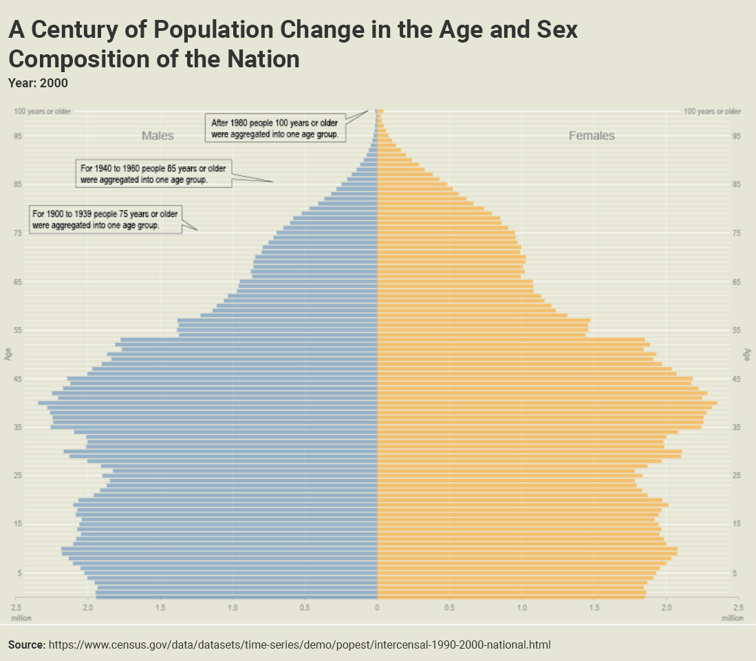
Population Pyramid
Also known as: age-sex pyramid
A population pyramid is a graphical illustration of population distribution across different age groups and genders.
Population pyramids consist of a series of histogram bars on opposing sides, with one side representing male and the other female. Each row (or bin) of a population pyramid represents an age group and together they form the shape of a pyramid.
Examples
Guidance
In addition to the guidance provided in this section, relevant guidance can also be found in the Agency Logo, Axes, Colors, Grids, Labels, Legends, Source, Titles, Typography sections.
Requirements
Always
-
Place the y-axis in the middle of the x-axis at the zero marker.
-
Display males on the left and females on the right.
-
Display age groups on the y-axis and population size on the x-axis.
-
Use uniform bin sizes.
Never
-
Never use more than two colors.
Recommendations
Recommended
-
Alternate between two shades of color for each row for improved legibility.
-
Leave space between each row.
-
Label the y-axis on boths sides of the chart.
-
Use different colors to represent male and female.
Not Recommended
-
Don’t label the y-axis in the center of the chart.